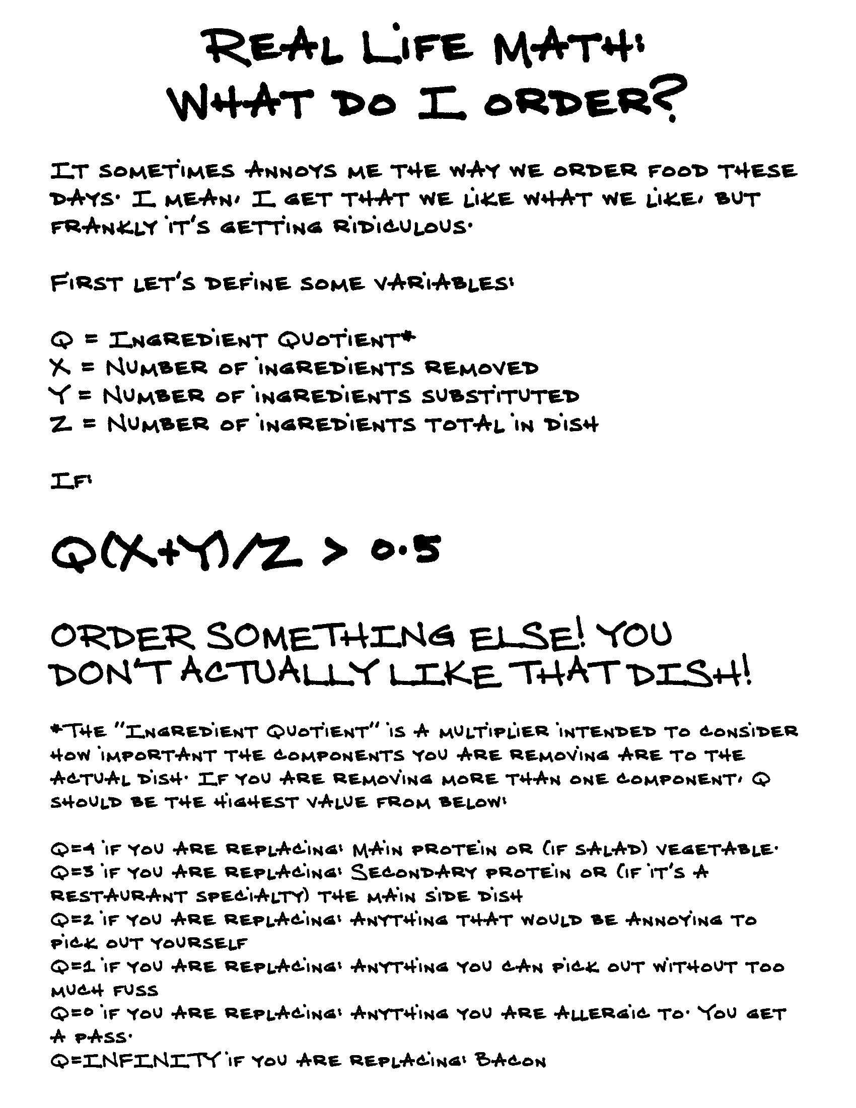
Real Life Math! is a new series of posts which will hopefully provide some useful formulas that people can use in their every day lives. These formulas have been rigorously tested in real-life scenarios and have been found to be correct.
Today’s Real Life Math! stems from a problem many of us face: we like eating out at restaurants, but sometimes, the dish described on the menu (or by the server, if it’s a fancy place where the servers memorize the ingredients) is not quite to our liking. Maybe it sounds too spicy, or perhaps we just can’t stand the thought of any stray are-those-red-or-white-onions-oh-they’re-red-yeah-then-no-onions-please making it into our stomachs. I mean, the horror!
So instead, we remove items. And we substitute. And the restaurants let us do this! It’s great! Freedom of choice, people! “Have it your way” isn’t just for Burger King anymore!
Thanks to our consumption of countless hours of the Food Network (and the many, many other food shows across the television landscape), we know more about food than ever before. Unfortunately, this also means that we swing too far in the other direction, and have now come to a place where we sometimes believe our knowledge level surpasses that of the chefs preparing our meal, and thus know exactly how the dish that they created should instead be served to us.
This formula is designed to solve this particular problem, as a handy guide to help you consider whether or not you should order the dish you’re about to order. I mean, it sounds great, right? But if only they’d just adjust it slightly…

